
hillaryclinton.com
Hillary for America: art direction, strategy, interaction design
In the four years since the last presidential race, internet users increasingly expect content and video built for mobile browsing. With the 2016 refresh of hillaryclinton.com, we optimized the experience for high quality content, smart navigation, and accessibility. A modular design led to record levels of fundraising and volunteering while a cohesive design system allowed for rapid response.
Optimized for performance, built to share, and made for mobile.

Home page
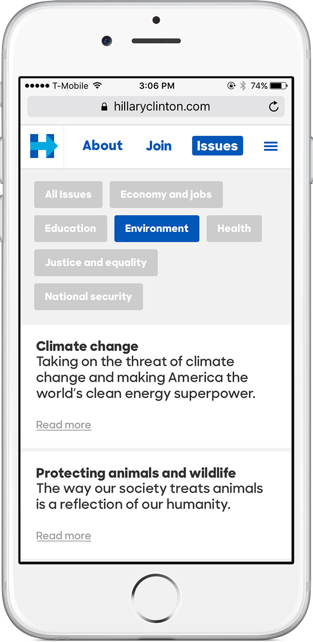
Policy picker

Biography

Article post

State landing pages

Expanded navigation
An immersive, visual, and useful product
With a team of writers, photographers and videographers, we used the website to celebrate our supporters, showcase emotional and personal stories, provide real-time reactions and break down wonky policy. The site always felt fresh, relevant and supportive of our candidate and the millions of people working to elect her.


The story of Her
Hillary has spent more than 30 years fighting for children and families. We designed a visual timeline to illustrate her biggest accomplishments.

Flexible and contextual actions
To allow for rapid testing of content, we built a highly flexible system for actions. An action could be embedded in a range of places throughout the site and optimized contextually.

Accessible and re-usable components
An important tool for our rapid iteration was a library of standardized components (we called it Pantsuit). Taking cues from our candidate, we designed a system that was accessible, bilingual, and adhered to the Web Content Accessibility Guidelines, choosing colors and sizes that offered appropriate contrast for people with low vision, providing keyboard-only page navigation, and tagging content for accurate screen reading.


The website was designed in record time - just four weeks! An important feature of the project was an agile design system that allowed for rapid optimization. Paired with a refactoring of the back end and a new CMS, the final site allowed us to quickly react to news stories, drive visitors to key actions like donations and volunteering, and promote new products like our mobile app. While creating a site from scratch, I established a more efficient workflow. This included training designers to optimize assets for site performance and design for maximum accessibility.